Industry
Fintech, Banking, B2B + B2C SaaS
Platform
Web & Mobile App
Skills
Product design, Interactive prototyping, Cross-platform Design & User Research
Team
Product designer (Me), Engineering team, PM
Timeline
March 2022 - July 2023
01. Overview
Raling is a business banking platform built around one idea: making everyday financial operations feel simple. Businesses can manage their money, issue virtual and physical cards, track transactions, control recurring expenses, and handle day-to-day spending from one place without dealing with the complexity behind traditional banking systems.
I worked as the solo Product Designer across the core experience. I designed key flows including the design system from the scratch.
The challenge was making a complex financial product feel clear, fast, and trustworthy.


02. THE PROBLEM
Running a business in Pakistan comes with a lot of financial friction.
Payments are slow, business banking is still heavily dependent on traditional processes, and teams often have to jump between different tools just to manage cards, expenses, transfers, and recurring payments.
Raling was built to simplify that.
The idea was simple: give Pakistani businesses one place to manage their money without making them deal with the complexity of traditional banking.
That problem shaped everything that came next — from onboarding and verification to cards, transactions, and everyday money management.

03. WHAT SHAPED THE PRODUCT
I looked at how Pakistani businesses currently manage everyday finances — from bank transfers and company cards to expense tracking and recurring payments — and compared the experience with modern products like Revolut Business, Wise, Mercury, and Ramp.
Three insights shaped the direction:
Trust comes before speed. Businesses want faster banking, but not at the cost of control. Clear balances, transaction states, card controls, and confirmations had to make every action feel safe and predictable.
Business banking should feel like software, not paperwork. Traditional banking often exposes users to processes, forms, and internal complexity. Raling needed to hide that complexity and organize the experience around simple tasks: send money, issue a card, check a transaction, control spending.
The important information changes with the task. A founder checking a balance needs simplicity. Someone reviewing company spending needs more detail. Instead of making every screen equally dense, I designed the hierarchy around what the user is trying to do at that moment.
These principles became the foundation for the onboarding, cards, transactions, and the wider product experience.


06. The onboarding problem
Opening a business account is usually where fintech products become complicated. Raling needs enough information to verify the company and the people behind it, but asking for everything at once would make the experience feel like paperwork before users even reach the product.
So I broke onboarding into smaller stages.
The first step is intentionally lightweight. We ask what the business wants to use Raling for, which helps establish context before moving into verification.
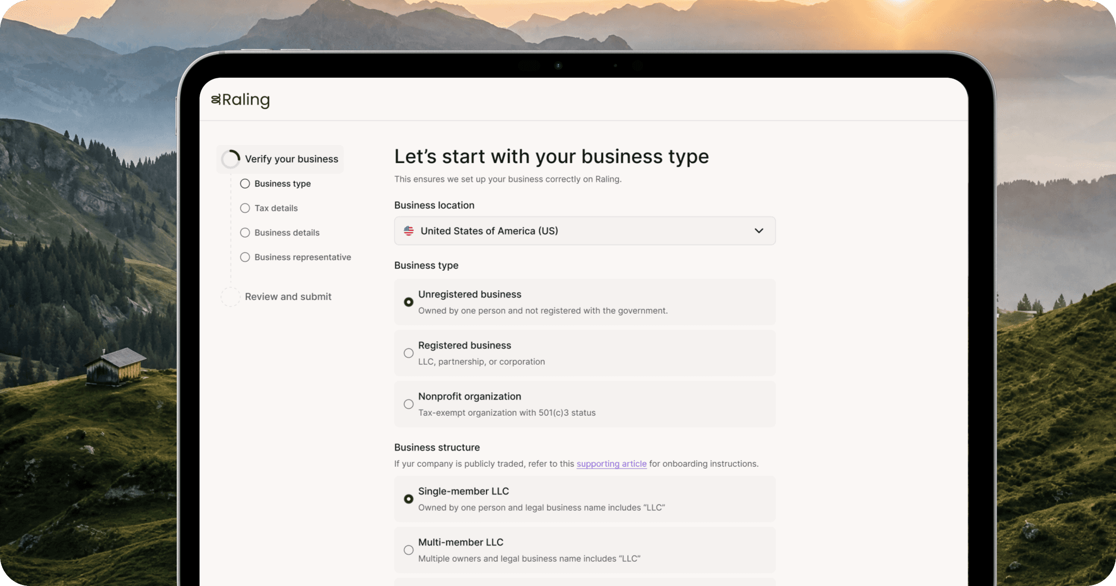
Once verification begins, the flow becomes more structured. Instead of presenting one long KYB form, information is grouped into clear sections such as company details, representative information, and business ownership.
I also made progress visible throughout the flow. Users always know where they are, what they are completing now, and what comes next.
The goal was simple: Raling still collects everything required for compliance, but it never feels like one giant form.

07. The dashboard
The dashboard had to do two things at once: give users a quick understanding of their financial position, while still surfacing the actions they use most often.
The challenge was avoiding the typical fintech dashboard problem where everything competes for attention — balances, transactions, cards, spending, notifications, and shortcuts all fighting for the same space.
I kept the hierarchy focused on the things a business owner would want to know immediately: how much money is available, what recently happened, and what needs attention.
The result was a dashboard that feels more like a control center than a reporting screen.

08. Cards
Card management was one of the most important parts of the product because it connects directly to how businesses control everyday spending.
Users needed to be able to issue cards, understand who they belong to, see their current state, and take quick actions without digging through settings.
I designed card controls around the card itself. Actions like viewing details, freezing a card, managing limits, or accessing settings stay close to the object they affect.
This made the experience faster and also reduced the cognitive load of remembering where controls live.

09. Payments
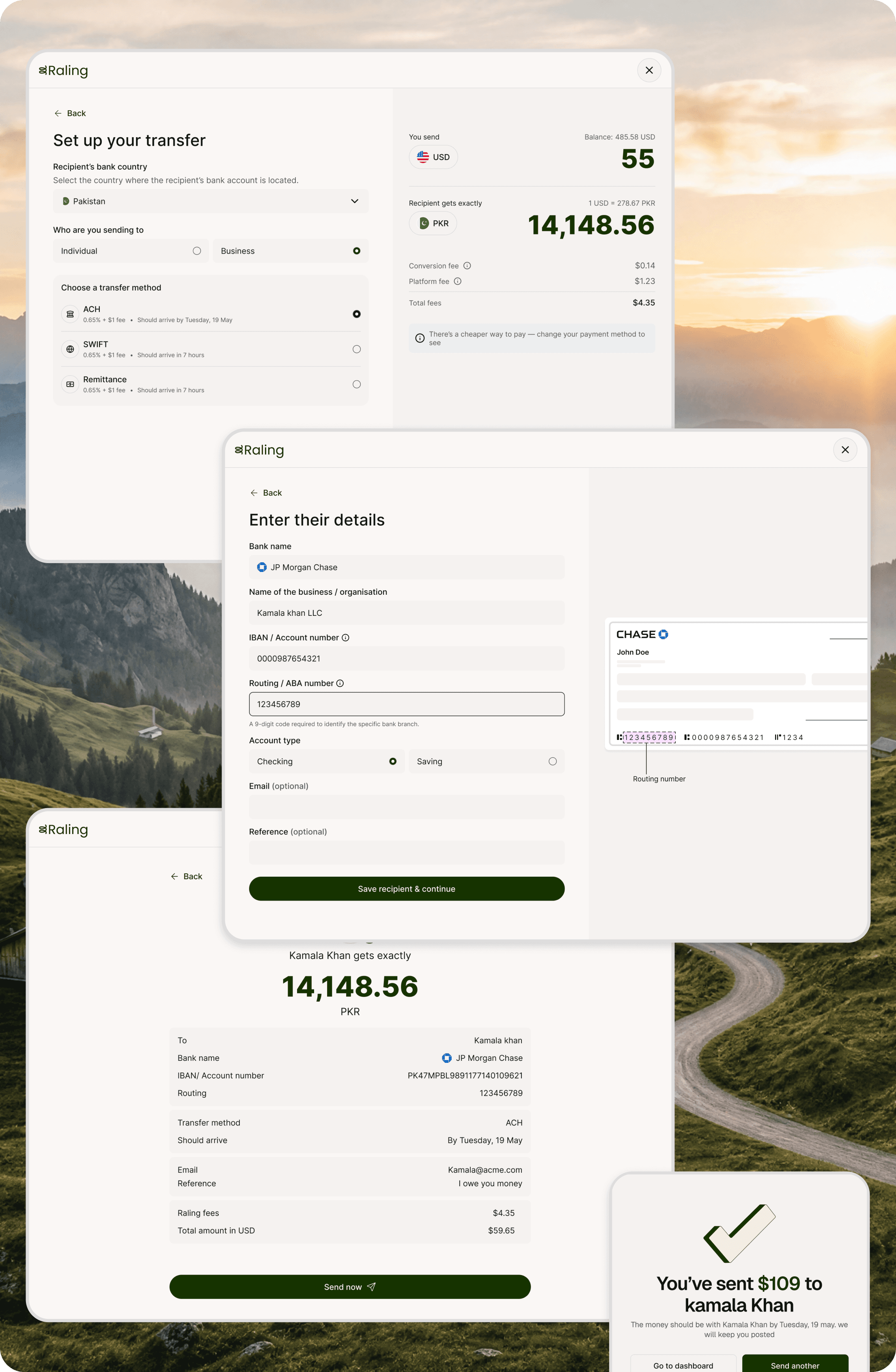
Payments are where clarity matters most because mistakes become much harder to fix once money has moved.
The flow was designed to slow the user down only where it matters.
Selecting a recipient and entering an amount should feel fast. But before the payment is submitted, the user gets a clear review step showing the recipient, amount, account, and other important details together.
This creates a deliberate moment of confirmation without making the entire flow feel slow.
The final state also clearly communicates what happened next — whether the payment was completed, processing, or requires attention.
In a financial product, confirmation is not just feedback. It is part of the trust experience.
10. Transactions
Transaction history becomes difficult to use very quickly once a business starts moving more money.
A simple table was not enough. Users needed to be able to scan activity, recognize merchants, understand payment states, and find something specific without opening every transaction.
I designed the hierarchy around the first questions users usually have:
Who was paid? How much? When? Did it go through?
Merchant identity, amount, date, account, and status are therefore surfaced before secondary information.

11. Request Money
Requesting money needed to work even when the person paying had never used Raling before.
We designed the flow around a shareable Raltag and QR code. Once a user creates their Raltag, they can send a payment link or QR to anyone instead of sharing long account details manually. The setup also handles availability, formatting, and error states upfront so every Raltag remains unique and easy to share.

Opening the request takes the sender to a lightweight payment page built around the recipient, not around Raling itself. They can immediately see who they are paying and choose the method that works for them — Raling, bank transfer, or stablecoin.
This was important because receiving money should not depend on convincing the other person to create an account first.

My role on Raling went beyond designing screens.
As the solo Product Designer, I was also responsible for building the design system from scratch, defining reusable patterns, documenting interactions, and making sure the product stayed consistent as new flows were added.
A big part of the work was thinking beyond individual features — how cards, payments, onboarding, transactions, and account management should all feel like parts of the same product rather than separate tools.
That foundation made it easier to move faster without compromising consistency.
13. OUTCOMES
The product evolved from an early concept into a complete fintech experience , covering onboarding, business accounts, cards, transactions, payments, stablecoins, and money requests — all supported by a design system built from scratch.
As the product matured, we started seeing encouraging early traction and interest around the direction we were building.
Then the constraint changed.
Raling was a capital-intensive product operating in fintech, and the company was unable to secure the funding needed to continue toward launch. The founder ultimately had to wind down the company before the product could reach the market at scale.
That meant the outcome wasn't a launch metric or revenue number.
For me, the outcome was leaving behind a product that was designed, structured, and ready to scale — but stopped by a business constraint rather than a product-design one.
14. REFLECTION
Raling taught me something that successful case studies don't always show:
You can do good product work and still not get the ending you expected.
We solved difficult problems, simplified complex financial flows, built a scalable system, and were beginning to see signs that the direction resonated. But product quality alone can't solve funding, regulation, or the economics of building a fintech company.
It also changed how I think about senior product design.
My job wasn't just to make the screens better. It was to keep asking what users needed to understand, where they needed reassurance, what could be simplified, and what absolutely could not.
The work I'm most proud of is the foundation we built. Raling grew from disconnected ideas into a coherent product where onboarding, cards, payments, transactions, and account management all spoke the same language.